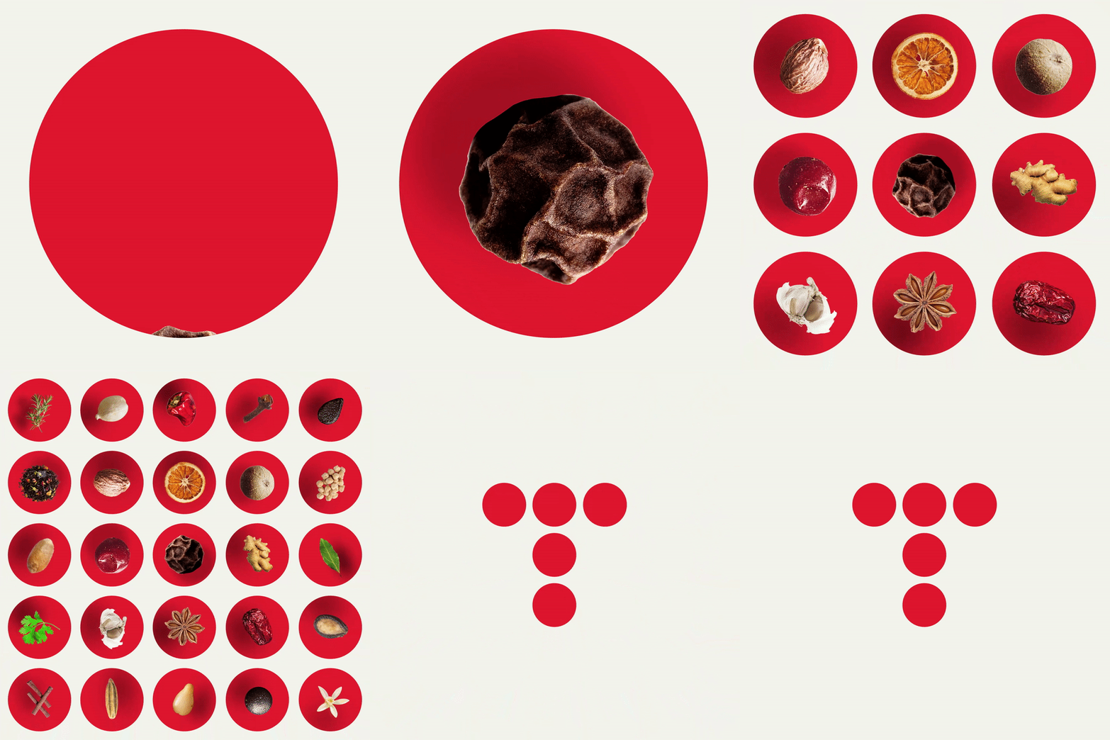
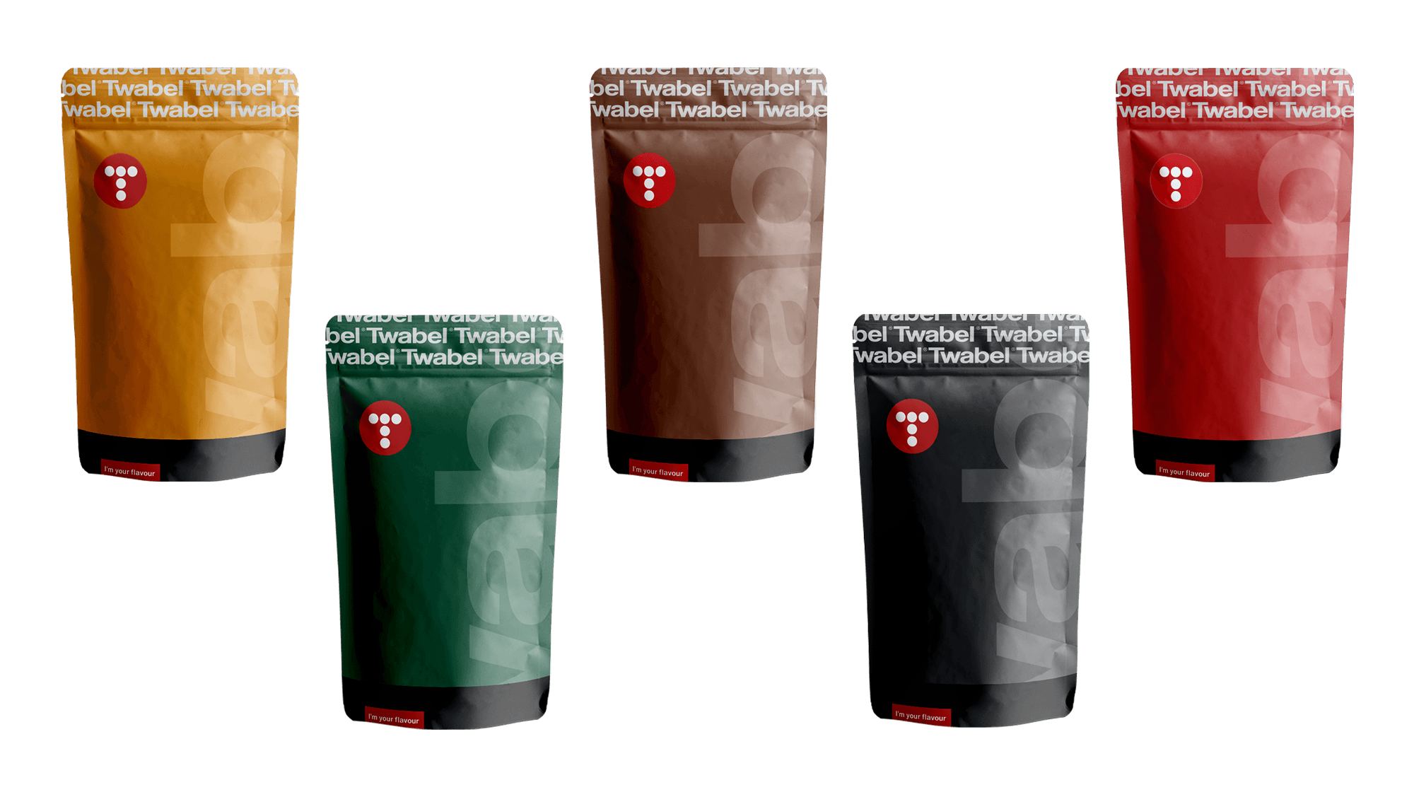
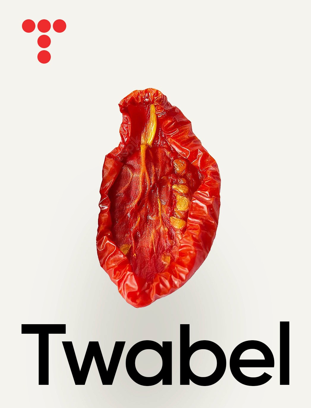
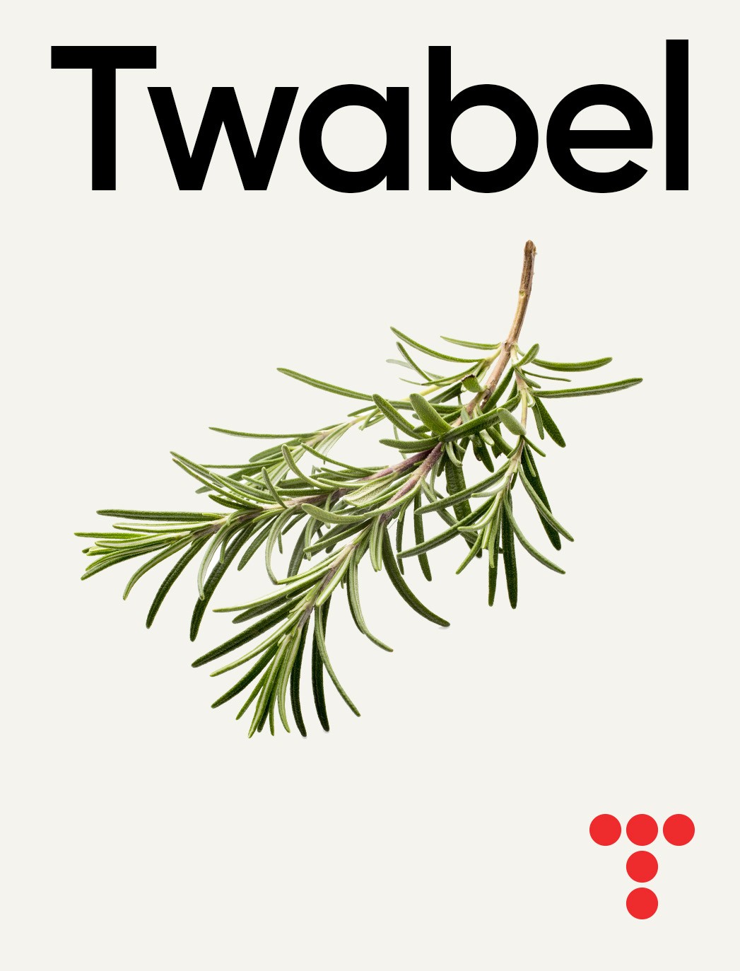
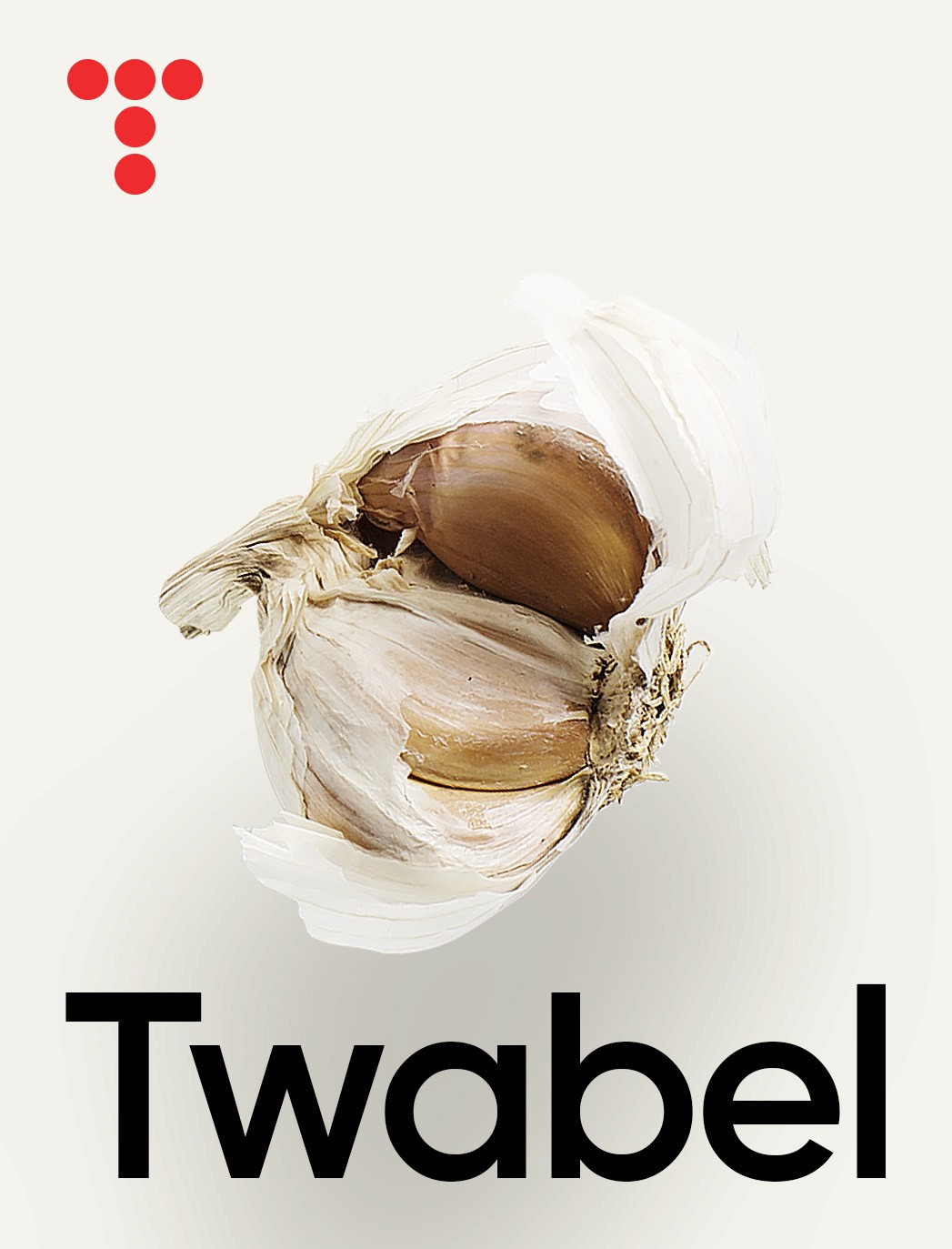
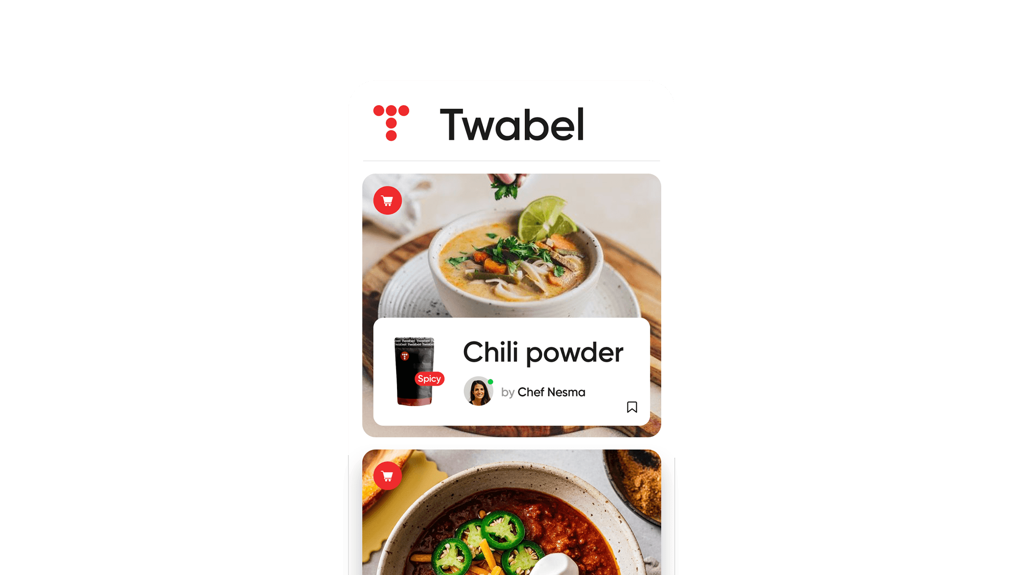
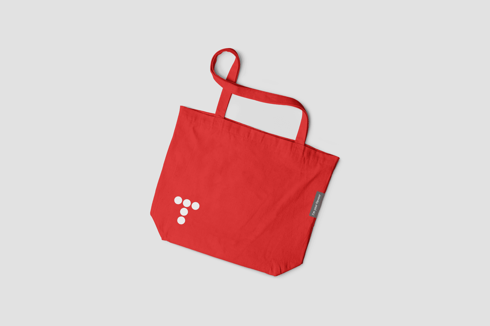
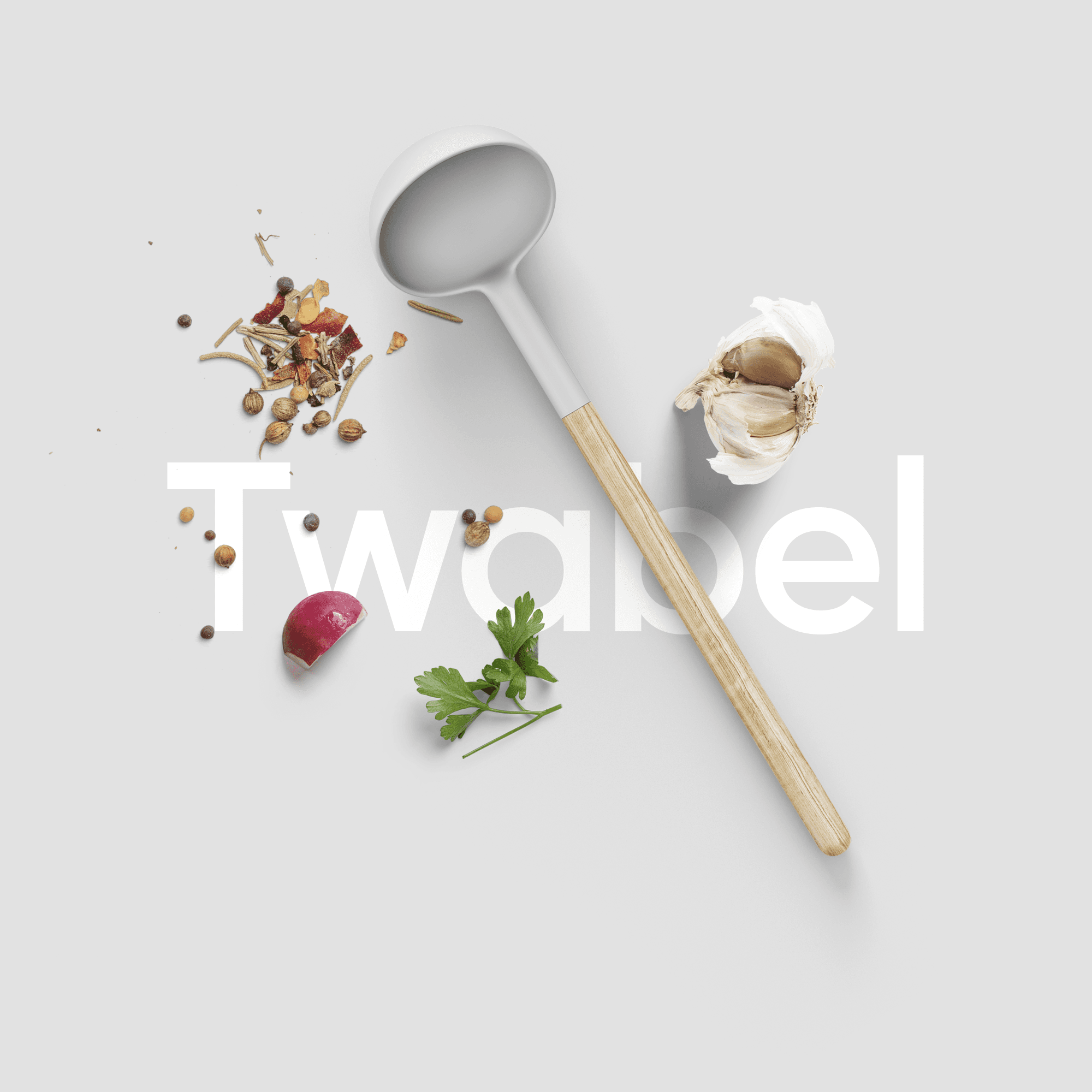
Food can hold attention before a single word is read. In the Twabel presentation, a close view of a dried tomato becomes the centre of the composition, with its folds, colour and texture given the space to register. It is a simple image with an immediate connection to the subject. The identity pairs that detail with a large, clear wordmark and a compact red symbol built from circles. The contrast gives the work two distinct qualities: the typography provides structure, while the food imagery brings variation and appetite. An open background lets both remain easy to see. Across the presentation, the relationship between the name, the symbol and the image provides a recognizable starting point. The brand does not need every element to compete for attention at once. A change in scale or a shift in the ingredient can give an application a different emphasis while retaining the same visual character. The project presents food branding through close observation. Its interest comes from the ingredients themselves and the clarity of the design around them, creating a visual invitation to look more closely and discover the brand.
Food can hold attention before a single word is read. In the Twabel presentation, a close view of a dried tomato becomes the centre of the composition, with its folds, colour and texture given the space to register. It is a simple image with an immediate connection to the subject. The identity pairs that detail with a large, clear wordmark and a compact red symbol built from circles. The contrast gives the work two distinct qualities: the typography provides structure, while the food imagery brings variation and appetite. An open background lets both remain easy to see. Across the presentation, the relationship between the name, the symbol and the image provides a recognizable starting point. The brand does not need every element to compete for attention at once. A change in scale or a shift in the ingredient can give an application a different emphasis while retaining the same visual character. The project presents food branding through close observation. Its interest comes from the ingredients themselves and the clarity of the design around them, creating a visual invitation to look more closely and discover the brand.
Food can hold attention before a single word is read. In the Twabel presentation, a close view of a dried tomato becomes the centre of the composition, with its folds, colour and texture given the space to register. It is a simple image with an immediate connection to the subject. The identity pairs that detail with a large, clear wordmark and a compact red symbol built from circles. The contrast gives the work two distinct qualities: the typography provides structure, while the food imagery brings variation and appetite. An open background lets both remain easy to see. Across the presentation, the relationship between the name, the symbol and the image provides a recognizable starting point. The brand does not need every element to compete for attention at once. A change in scale or a shift in the ingredient can give an application a different emphasis while retaining the same visual character. The project presents food branding through close observation. Its interest comes from the ingredients themselves and the clarity of the design around them, creating a visual invitation to look more closely and discover the brand.